Role: Brand Name, Brand Identity, Brand Visualizations
The Challenge
Develop an eyewear brand name and identity for a company with a strong presence in prescription eyewear for sports. The new brand would stand alone and extend their reach beyonds sports optics. My role was to develop the strategy, name, identity, and branding of a new iconic everyday eyewear brand.
The Pitch
For the pitch, I walked the clients through many name options, landing on my eventual recommendation. The process involves starting with 60+ options and filtering out names based on competition, legal, and creative reasoning. landing on the a short and memorable name — Forth Eyewear.
Beyond it’s brevity, Forth represents exactly what eyewear does. By definition, Forth means: To move forward or into view. It connects directly with their mission and what their products are designed for.
Brand Visualizations
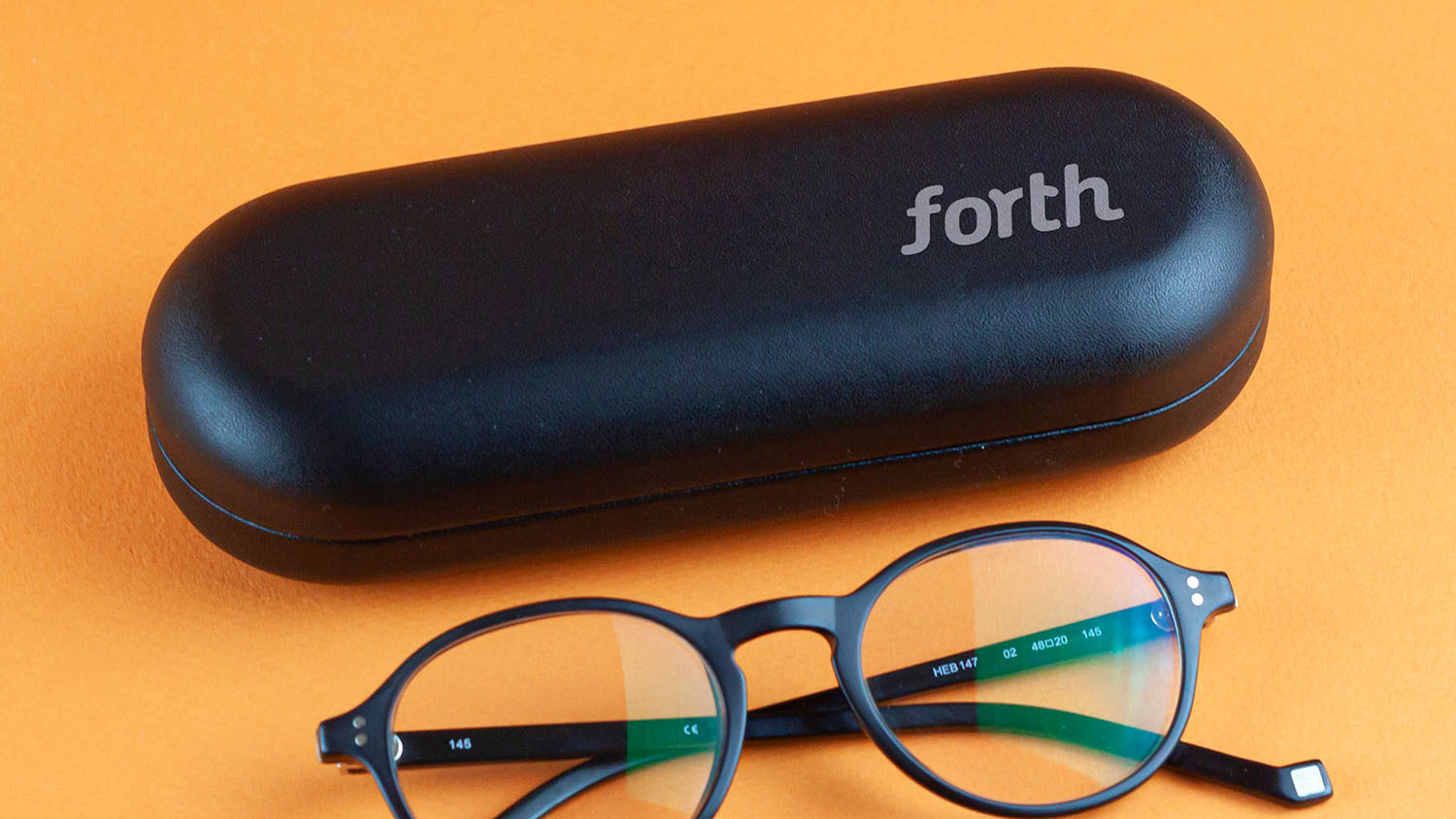
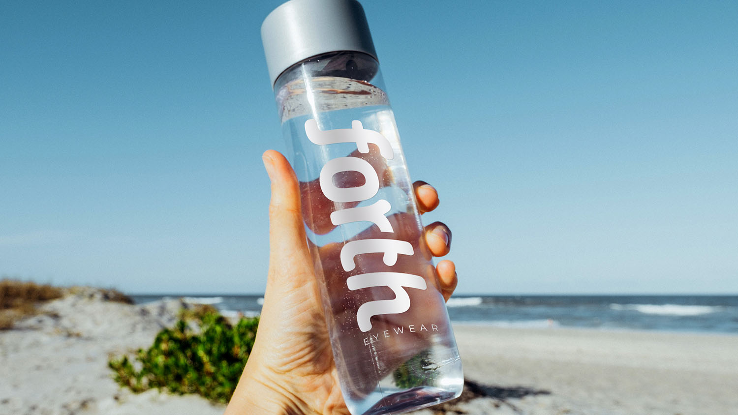
Everyone agreed the name was catchy and fun, but sometimes you have to see it in the real world to really know. I developed visuals of the logo in use to encourage everyone to LOVE the concept.


Advertising
We had a name we loved. I knew I had them on the hook, but really what delivers a brand essence better than a short and well crafted tagline? “Go Forth. Go Focused.” represents how the product can help you live a better life, eliminating the obstacle of bad vision and replace it with forward movement. OOH advertising reflects that visually and in words with movement and a warmly confident identity.

Digital Advertising
Confidence, open space, and simplicity of presentation were used to project clarity. Alongside the value proposition of quality eyewear at a great price, the messages of focus and movement simply and comfortably guide the user to shop styles.


The Outcome
The team loved the concept, the name, the visuals, and the overall approach. It’s a brand to look for moving forward.
